Sign up for daily news updates from CleanTechnica on email. Or follow us on Google News!
Last Updated on: 5th April 2025, 03:06 am
One of the big stories of the week has been Tesla’s poor Q1 2025 sales numbers, with the brand dropping 13% year over year (after already having a YoY sales drop in Q1 2024). This is especially painful for a company that was supposed to be growing 50% a year on average in the 2020s, according to CEO Elon Musk (though, he’s been quiet about that previously consistent prediction lately).
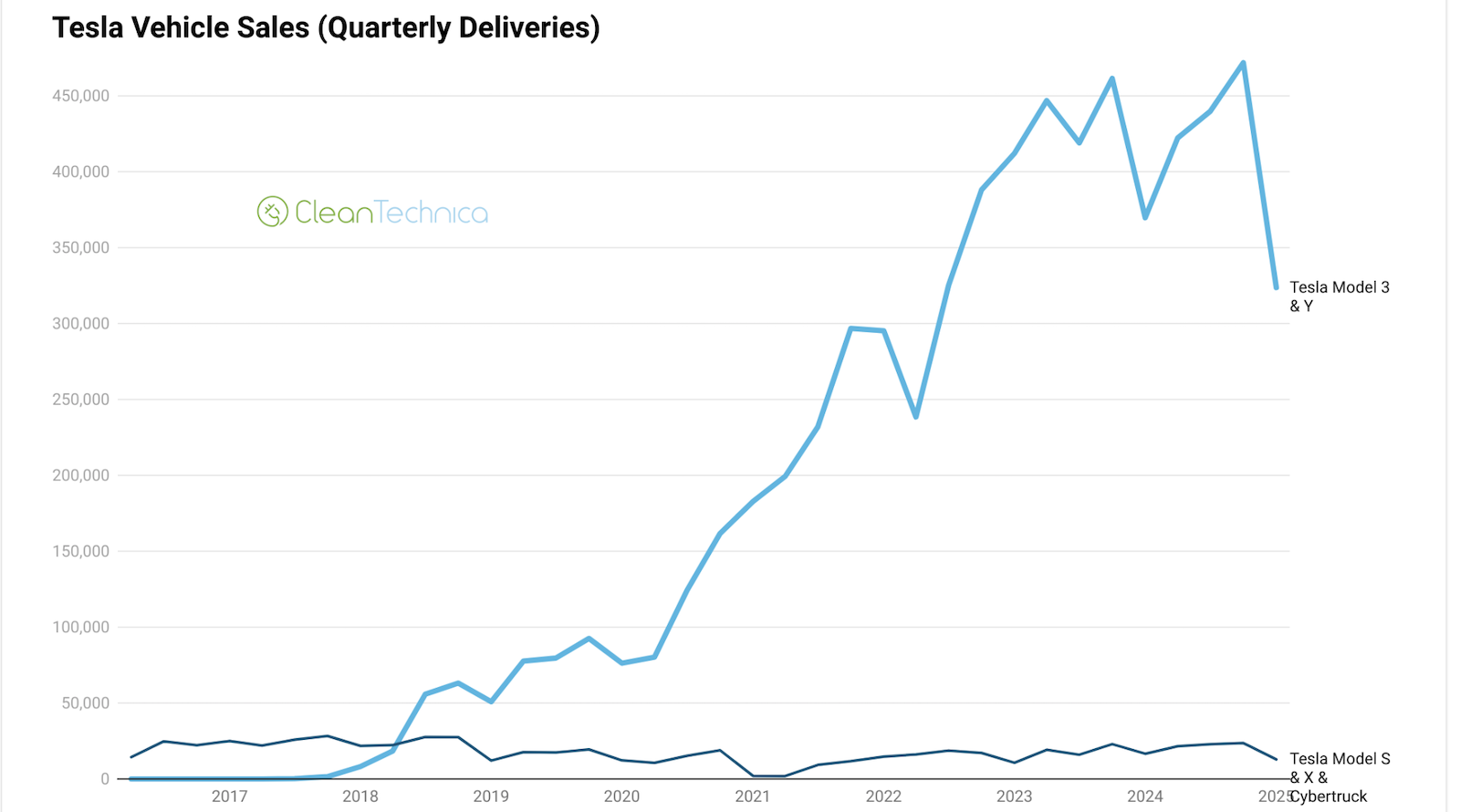
However, looking at the quarterly and YoY figures just gives a glimpse of the issue. Putting together the long-term quarterly sales charts that I’ve been creating for Tesla in the past several years, the problem stood out to me much more. Have a look below and see what you think. Somehow, the reality of the drop just hits much more looking at these. The drop in sales in the context of Tesla’s previously sales growth truly stings.
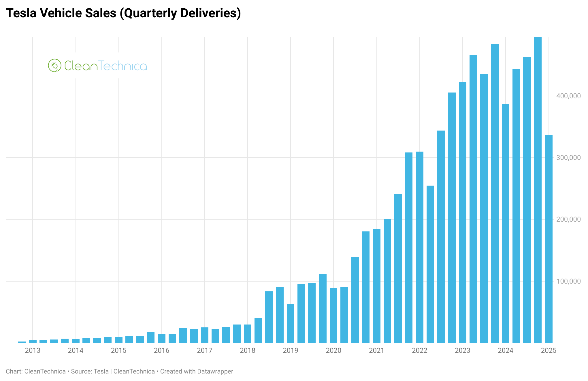
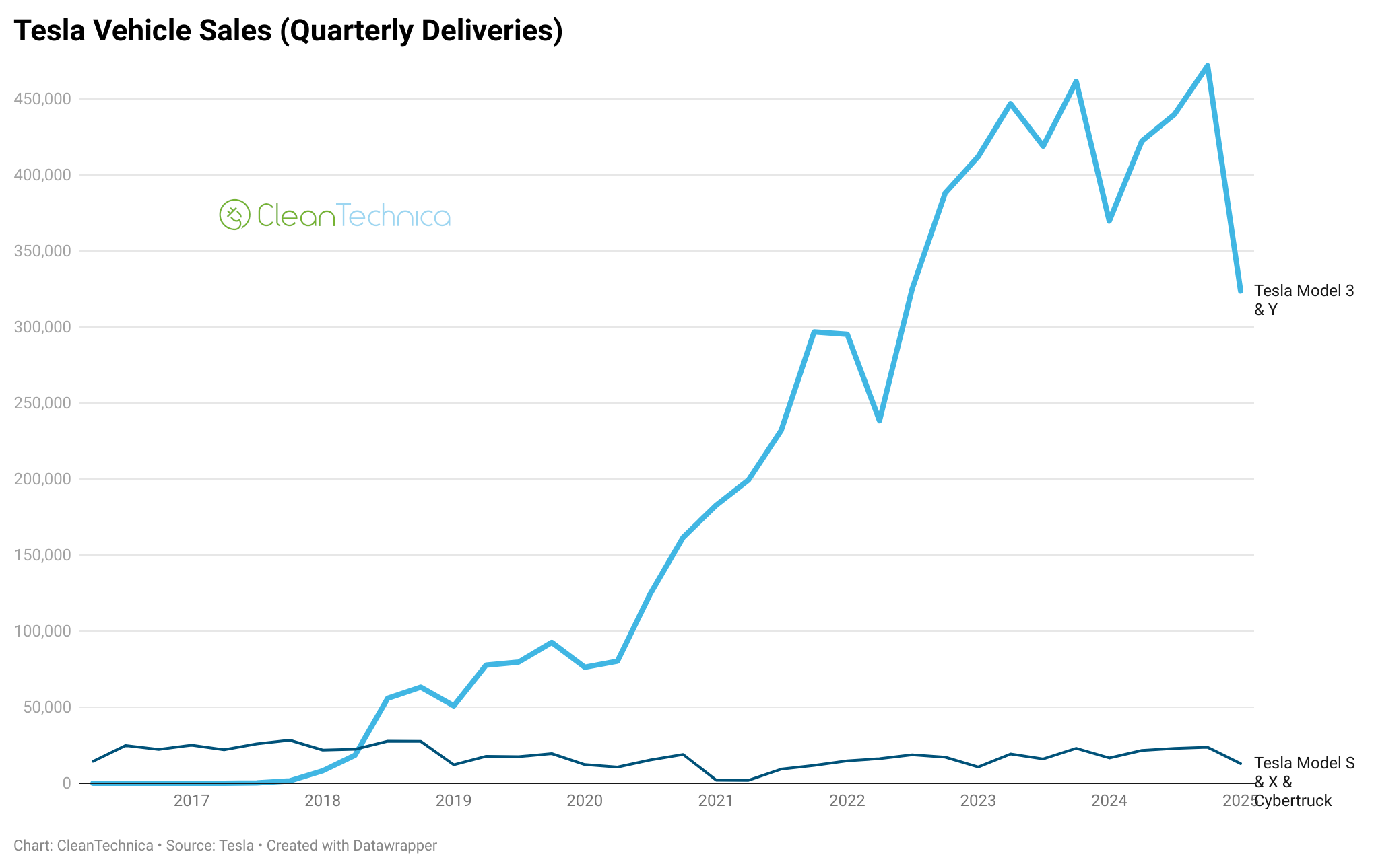
As you can see in the chart and graph above, Tesla saw an unprecedented, massive drop in sales in Q1 2025. It’s never had such a dramatic drop in sales — quarter over quarter or year over year. In fact, on a quarterly basis, Tesla has had almost no year-over-year sales drops. So, the start of 2025, especially on the back of a weak 2024, is striking and signifies to many that a close eye should be kept on Tesla sales trends in 2025. It’s whole story (historically a story of growth, massive growth) could be shifting. Many fans don’t believe it — or don’t want to believe it — but it’s a clear possibility and there are a few big reasons why it could be happening and could be the EV story of 2025.
One last note before sharing the remaining charts: Tesla only reports Model 3 & Model Y sales numbers together and Model S & Model X & Cybertruck numbers all combined as well. We don’t have precise numbers for each model. (That’s been a massive gripe for years, and I think it’s a bit absurd that an automaker of its size isn’t more transparent on model sales, but it is what it is.) As a result, to create these charts, I have to use various sources and make some assumptions in order to come up with model-specific sales estimates. These are just estimates. We’ll get more data in the coming month and be able to better see how the sales split out by model. Importantly, coming up with the estimates for Model Y vs. Model 3 sales was especially difficult this quarter due to the new Model Y coming out and Model Y production lines being shut down for a notable period of time in order to update them for the new Model Y.
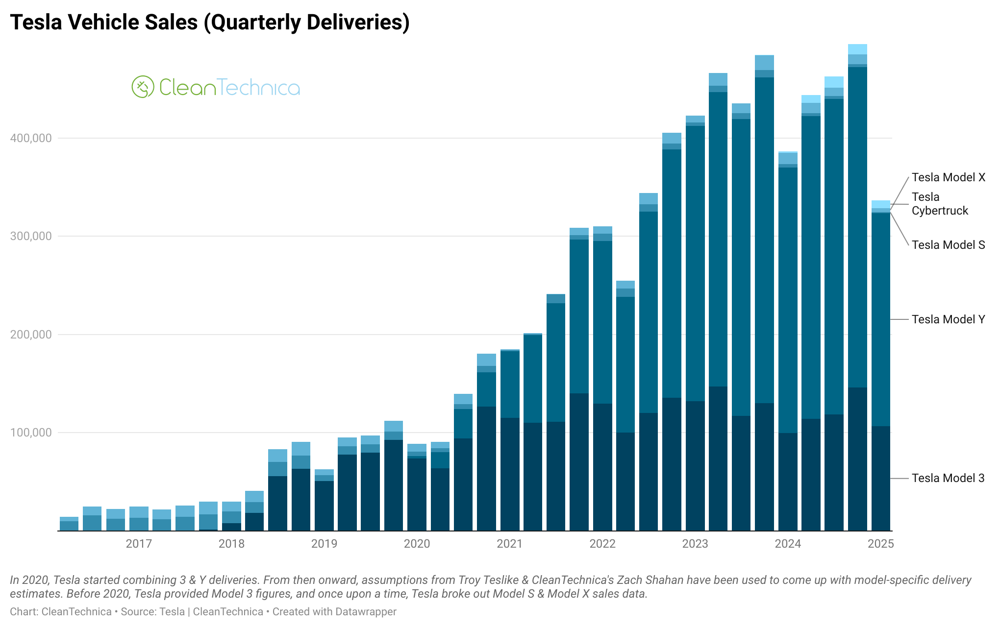
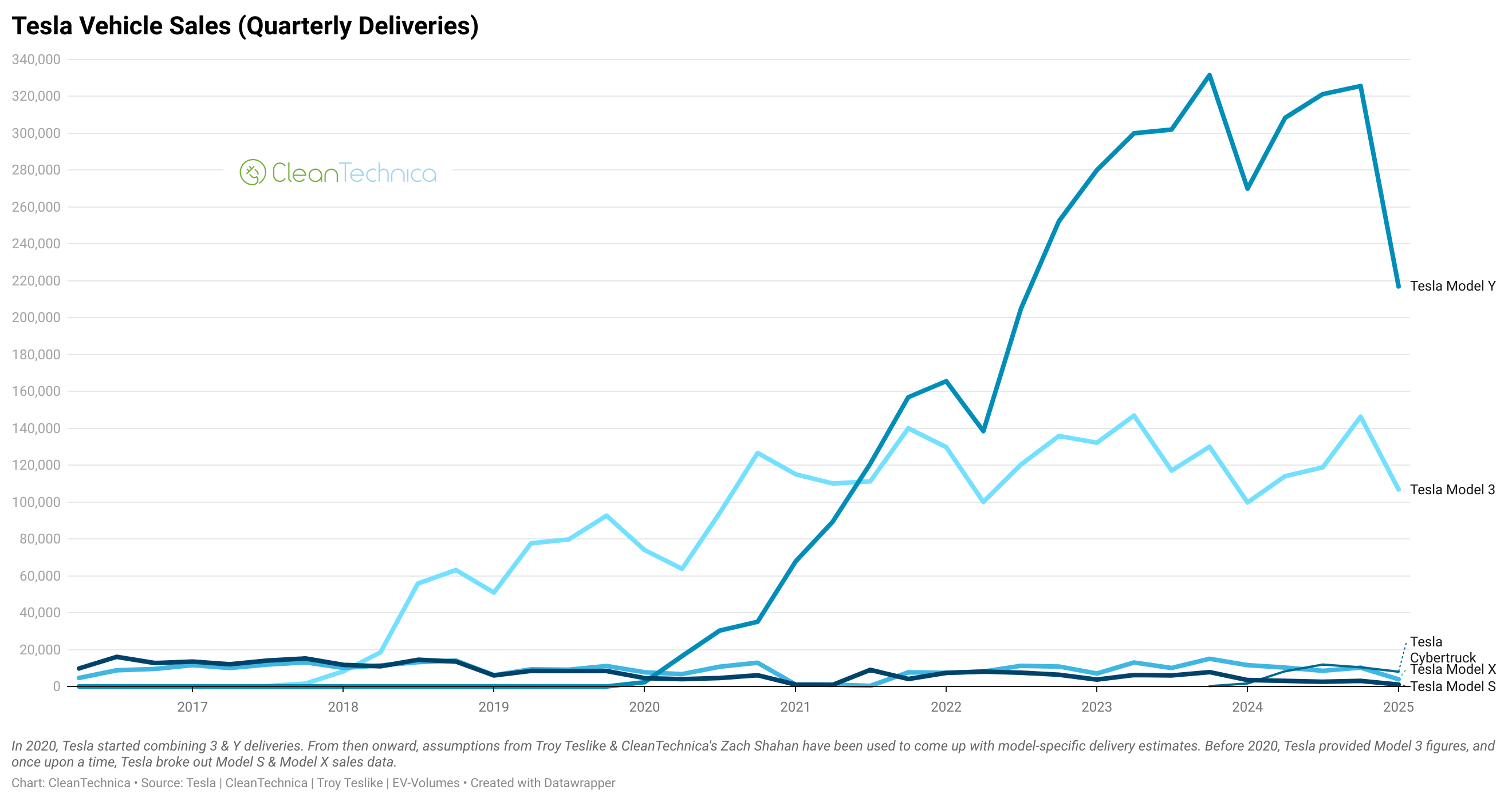
Importantly, while there is some excuse for Model Y sales being down, Model 3 sales also appear to be down significantly, and there’s not really an excuse for that! Changing over the production lines for the Model Y shouldn’t be affecting the Model 3 like this. Also, its debatable whether the Model Y should really be facing such a significant decline itself despite the production line disruption. But I think we really need to see what happens in the next quarter or three to make any solid conclusions on trends for that model.
While it doesn’t stand out in the surface with the graph and chart above, when you think about it for a moment, the lack of sales from the Cybertruck is striking. This model was supposed to provide a big boost to Tesla sales, the next avenue for ongoing auto sales growth for the company. But it seems to be a dud. It’s almost invisible here, and already apparently going in the wrong direction! Yikes. For that matter, Model S and Model X sales are also down. That may not be super critical to the company’s story or finances, but it’s not good! Sales volumes had already dropped a lot in the past several years, but they got to a concerningly low level in Q1. (And, again, there’s no decent justification for this, unlike the case Tesla fans and shareholders have been making for the Model Y.)

Now we’ve got the cumulative sales charts. This first one, using official numbers, shows a shift from exponential growth to, potentially, a flattening of growth. Just visualizing where things go from here, it’s easy to see the line at the top getting flatter. Of course, that can change with a surge in sales from the new Model Y (and/or Cybertruck). But, for now, we have an obvious breaking of the historical trend — even looking at this cumulative sales chart.
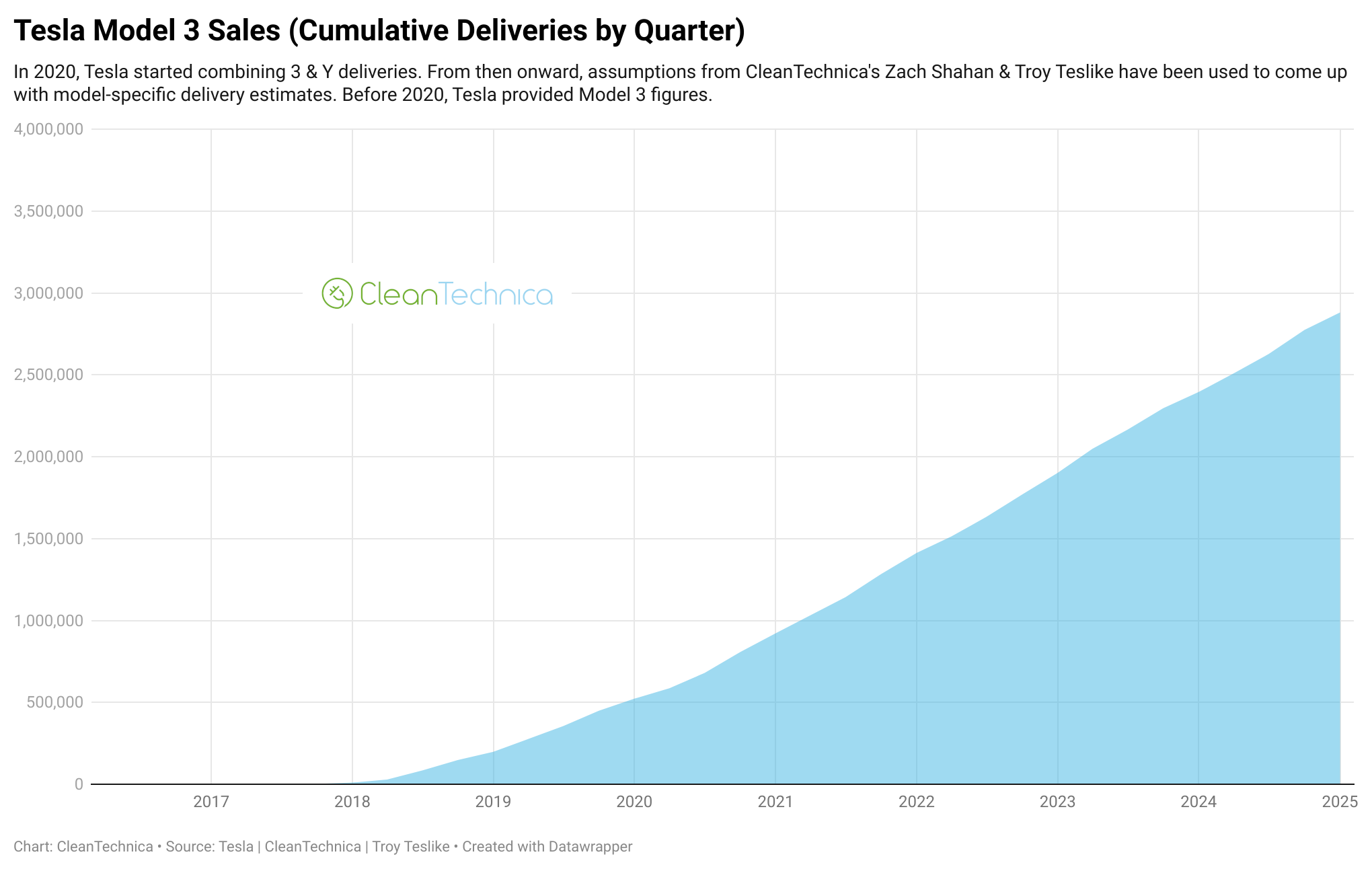
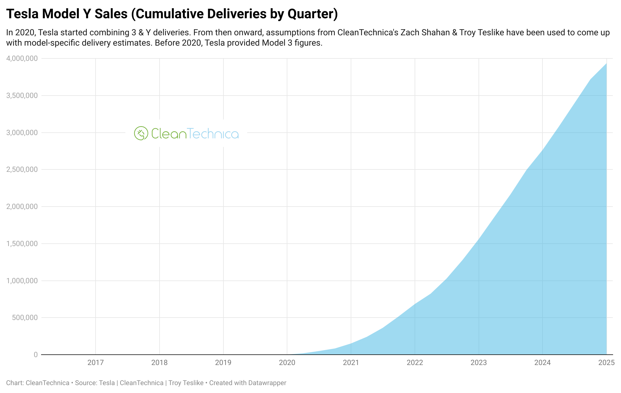

Using our estimates for the Model 3 versus Model Y sales split, it’s a similar story — just a bit less pronounced looking at the Model 3 chart, which isn’t historically as impressive as the Model Y’s.
Does anything else significant stand out to you when looking at these charts and graphs? And where is Tesla going from here?
To wrap up, below are interactive versions of these charts and graphs, as well as one extra chart where you can pop from one model to the next. Enjoy! (Note: these are best viewed and played with on a real computer, not a phone.)
Whether you have solar power or not, please complete our latest solar power survey.
Chip in a few dollars a month to help support independent cleantech coverage that helps to accelerate the cleantech revolution!
Have a tip for CleanTechnica? Want to advertise? Want to suggest a guest for our CleanTech Talk podcast? Contact us here.
Sign up for our daily newsletter for 15 new cleantech stories a day. Or sign up for our weekly one if daily is too frequent.
CleanTechnica uses affiliate links. See our policy here.
CleanTechnica’s Comment Policy

